Page Layouts can be seen as a game
February 18, 2015
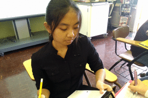
It has been more than a year since I helped lay out the print issue for The Pinion. I had to relearn how to add text and photos. I also had to get past obstacles such as fitting everything and making sure that I use the space effectively.
I understand the fun in fitting headlines. Changing the words to fit but making sure it still relates to the story was difficult but enjoyable nonetheless. I was able to overcome some of these difficulties by having it take up two rows of two columns rather than one row of all three columns. The satisfaction of fitting the headlines was worth the work and frustration.
In addition to the headline, it was a challenge to fit the words and art together without making it seem so crowded. I think that I succeeded in it but I definitely need more practice. I hope that with more practice, I can effectively layout pages and make them look appealing.
I think that the print issue layout process can be seen as a puzzle game. It was definitely a challenge but every good game is.


