Hey hey, second blog postey is here to stay
September 9, 2014
Sean Gleason, co-editor of McKinley’s newspaper here to share what I’ve learned as the layout designer for the Pinion. Last time I learned about inorganic and organic shapes and how they can make layouts stand out. This time I’ll be talking about what I learned about dominant pictures and articles.
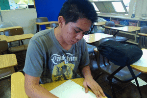
For The Pinion’c cover, I wanted to use it as a table of contents wherein each section (news, editorials, features and sports) would have a sub-header and a picture representing the best article from that section. Those pictures from each the sections would be the same size so I would be able to fit them all on one page. However, research has shown me that It’s better to have the best out of all the article our of all the sections represented on the cover the largest and to have the other section representations to be much smaller or not even present. From what I’ve seen, this method works really well and it makes covers look outstanding.
That’s it for this learning blog, see you next time!